A new visualization software for biotech
Biologists need tools that keep pace with their demands for integration, transparency, and collaboration.
Traditional software like GraphPad Prism, while once a staple, often falls short in these areas.
Integration with existing data sources: Scientists frequently struggle with importing data from platforms like GCP, S3, Drive, Excel, and Benchling, leading to inefficiencies and compromised traceability.
Transparency into underlying code: Access to the specifics of statistical analyses and plotting algorithms is essential for verification and customization, yet many tools keep these details inaccessible.
Collaboration capabilities: The lack of live editing and shared workspaces in desktop software hinders teamwork and slows down the research process.
We believe that the right tool should excel in these three areas while providing a delightful user experience for scientists and developers alike.
That's why we're excited to present Latch Plots, a new way to perform statistical analysis in biology.
Key Features
We built Latch Plots to balance the trade-offs of usability for scientists and flexibility for developers, while maintaining traceability for the entire R&D campaigns.
Bring Data from Anywhere
Latch Plots is not just another silo. You can bring data from anywhere and plot them:
Import files from Google Drive, Sequence Read Archive (SRA), BaseSpace, or drag-and-drop files from your local computer or use the CLI.
Mount buckets directly from GCP and AWS S3. Any data going in and out of these buckets are synced both ways.
Sync Benchling Registry tables and plate maps to read-only tables in Registry. Then read these tables as Python dataframes and use it inside Plots.
With tight integrations into your existing system, teams don’t have to worry about data duplication and can focus solely on analyses.
Jupyter Notebook-Flavored for Developers
Latch Plots should feel familiar to Jupyter notebooks, where developers have infinite flexibility and can write any Python code that they want. Developers can also SSH into the dedicated computer behind every notebook, and install any dependency they want.
Infrastructure
The infrastructure layer allows access to extremely large instances. Any AWS instance type can be made available. Some existing notebooks use 1,952 GiB RAM or 4 A10G GPUs. Storage volumes of any size can be allocated. Resource requests can be adjusted without the need to copy data or dependencies between instances.
No more stressing over single-cell visualization apps crashing due to limited RAM or FlowJo slowing down your entire computer, preventing you from multitasking.
Interactive widget elements
Latch Plots come with Plot Widgets—easy-to-use immediate-mode GUI library which integrates with the reactive programming system. User interfaces are defined through simple inline Python function calls without a separate markup file.
Reactive execution model
Plots reactivity allows cells to re-run on changes in widget values to load new data or adjust computational parameters. An end-user scientist can change input parameters and automatically see plots & output result tables updated.
Flexible, no-code plotting cells for scientists
Scientists enjoy having freedom to customize their plots freely. Plot notebooks come with a “No-code chart” cell type with many built-in visualization types (scatter, bar, heatmap, volcano plot, and more)
Bonus: We also have a grouped scatter bar plot type that feels similar to GraphPad Prism, with standard deviation and mean calculations built-in!
Customize plots natural language prompts
Visualization is tricky — It’s hard to feel satisfied with the first plot generated from the no-code chart cell. Small tweaks are often necessary to communicate best insights.
Scientists can reach to PlotsAI, a built-in LLM based on Claude and OpenAI’s o1-preview, to modify their plot to their heart’s desire.
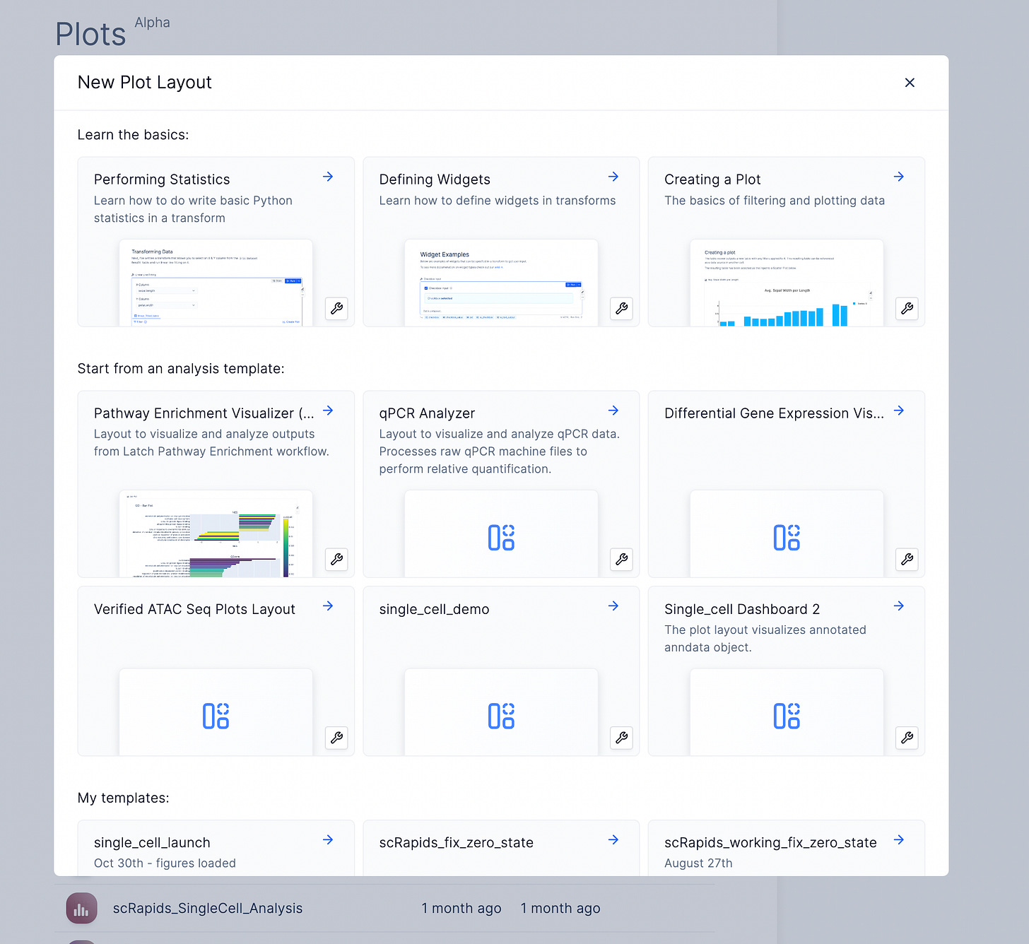
Put it all together. Turn Plot notebooks into standardized, reusable templates for teams.
We talked about how interactive widgets are used to trigger table transformations amd analyses, and build beautiful plots. Once all the blocks are assembled, one can turn it into a reusable template for the rest of their team.
Each template includes dependencies, data, and scripts, so the next person can add new data, click Run, and generate standardized plots instantly.
Each scientist can launch their own notebooks from the team’s base template, maintaining consistency while enabling personalized customization.
Generate Plot Artifacts downstream of bioinformatics workflows
Too often, scientists are left frustrated with raw outputs (e.g. Count matrices) downstream of workflows.
Once developers have built Plot templates (DESeq2, Pathway Analyses, etc.), bioinformatics workflows on Latch can also programmatically write out new notebooks based on these templates!
Imagine an nf-core/rnaseq workflow automatically creating a DESeq2 dashboard that enable scientists to compare differentially expressed genes between samples.
Build visualization for any assay
That's a wrap (for now). In upcoming posts, we'll highlight how Plots supports GPU-based single-cell visualization and other biochemical assays like qPCR, LC-MS, and deep mutational scanning.
In the meantime, we invite you to explore and build plots for your own assays.
If you want to try out Plots for your team, request a free trial here.


